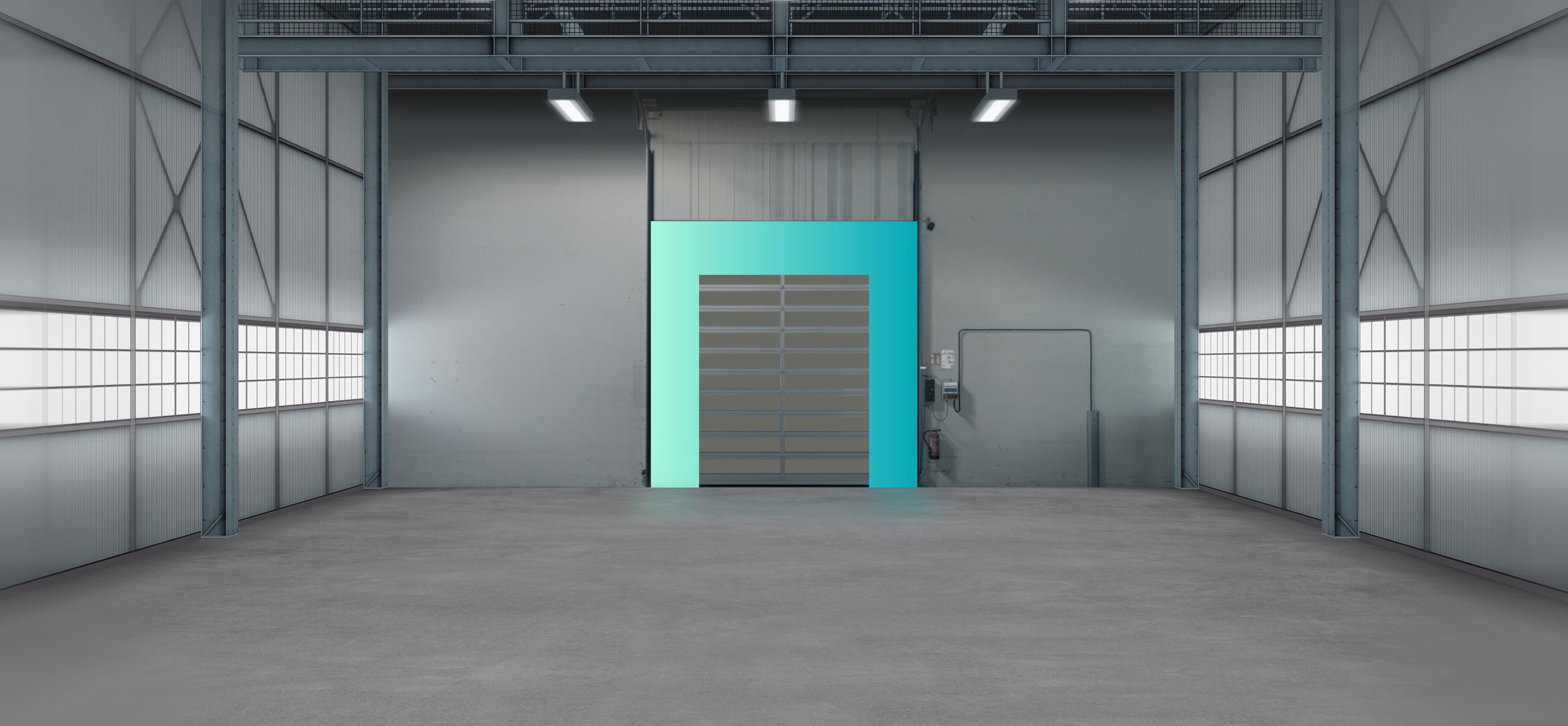
 JANSEN GROUP
Jansen Group : One strong brand for a growing international family business
How corporate branding works: everyone united under one umbrella brand
Summary
The family business Jansen Tore has grown into an international group of companies. This expansion brings ambitious goals and new values that call for a comprehensive rebrand. With a fitting, holistic communication strategy, we position the Jansen Group as a strong, future-ready entity.
Services
- Brand Building
- Branding
- Communication Campaigns
- Communication Strategy
- Marketing
- Online Style Guide
- Photography + Videography
- UI Design
- UX Design
- Websites
The Jansen group of companies shows what strong branding can achieve – and how crucial roll-out planning is for employees, clients and partners. In times of AI, internationalisation and ever fiercer competition, the brand becomes the decisive differentiator. Innovation drivers and new fields of work constantly confront companies with new challenges – and demand continuous development. Where does your brand stand?
Book an intro call
From the very first idea, u+i supported our rebranding with great professionalism, positioning the Jansen Group as what we are: an innovative, future-oriented company. Their expert guidance during the internal roll-out rounded off the success of the entire project. A collaboration we can recommend at any time.
Sabine AbelnHead of Marketing & Communications, Jansen Holding
A shared vision, an unmistakable identity
Successful change management thrives on communication – both visible and tangible. In a joint workshop, we developed the visual brand identity of the Jansen Group.
Three core values emerged that shape the entire branding: security, innovation and distinctiveness.
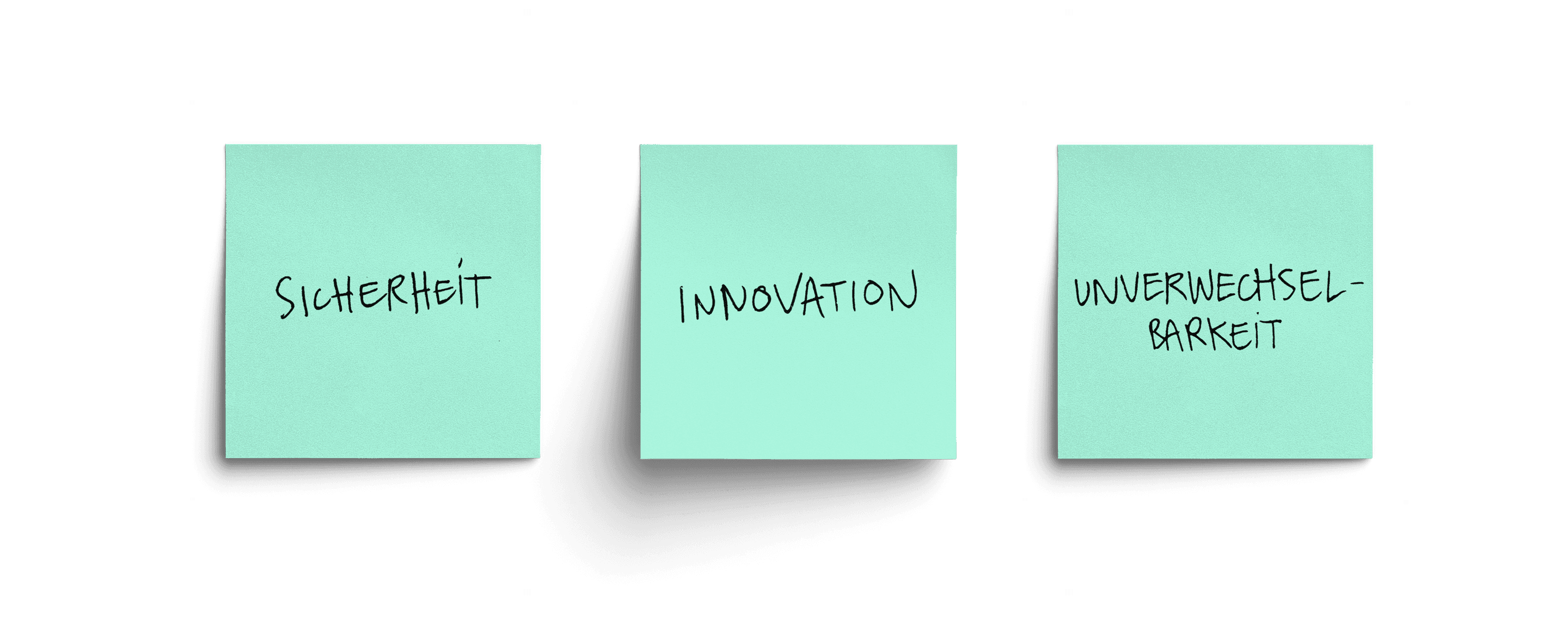
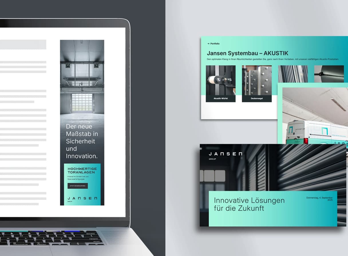
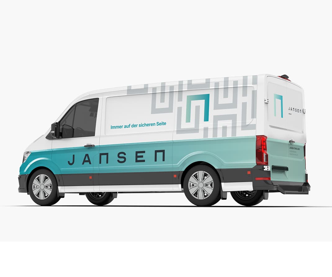
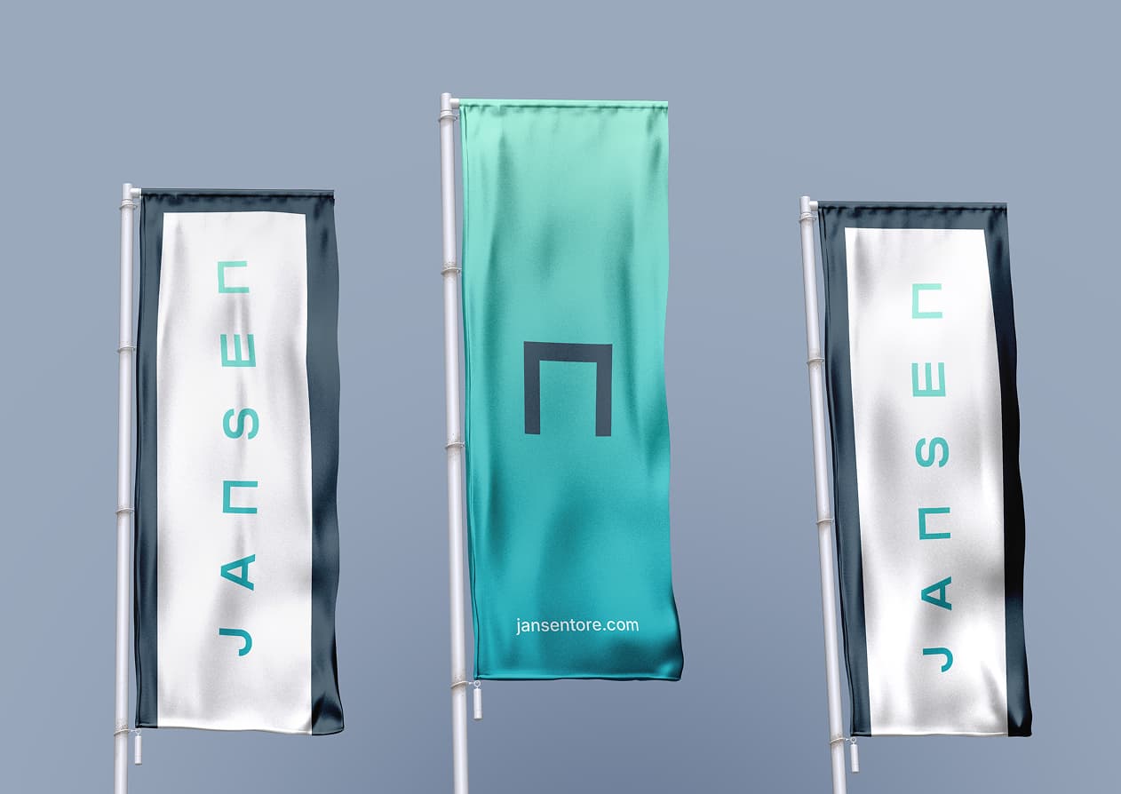
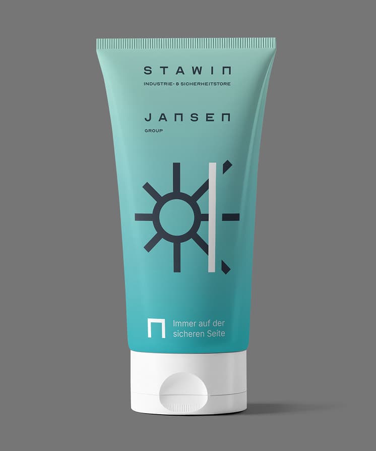
The petrol-to-mint gradient symbolises the innovative momentum within the group and literally runs through every medium. The colour scheme reflects modernity and stability and is as distinctive in the industry as the Jansen Group’s tailor-made solutions.
5 brands that clearly belong together
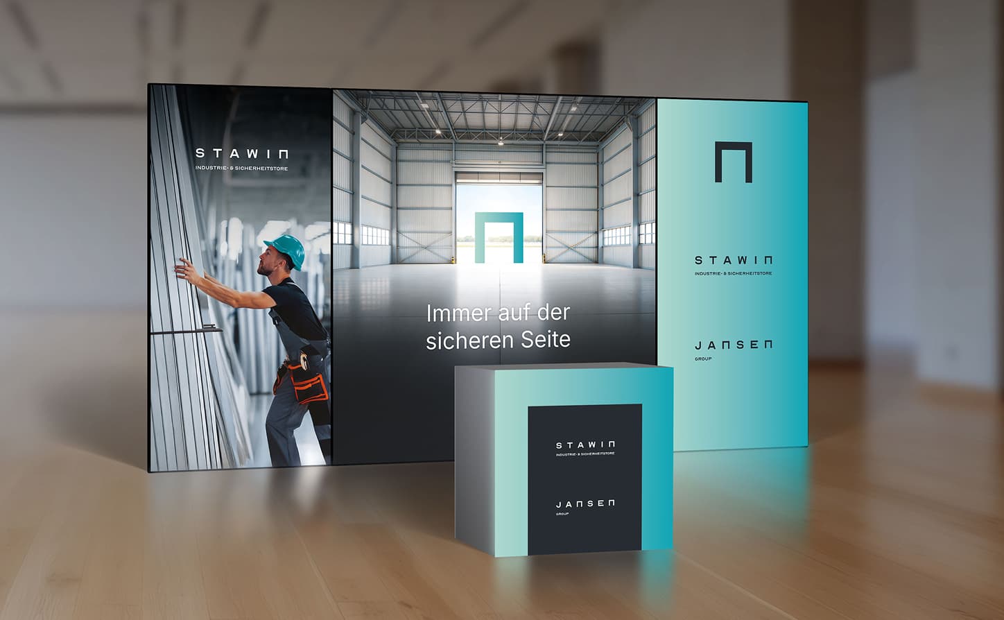
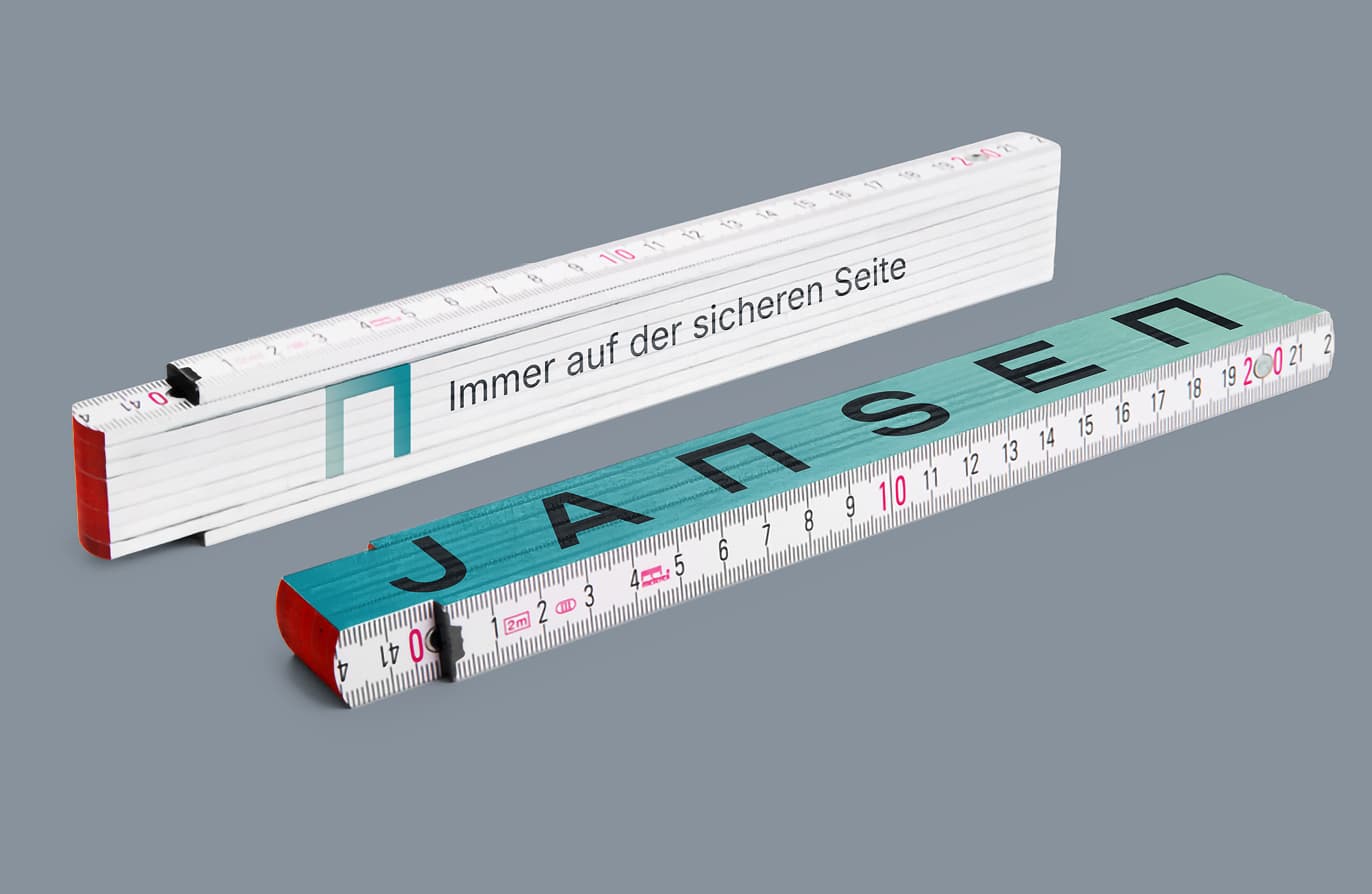
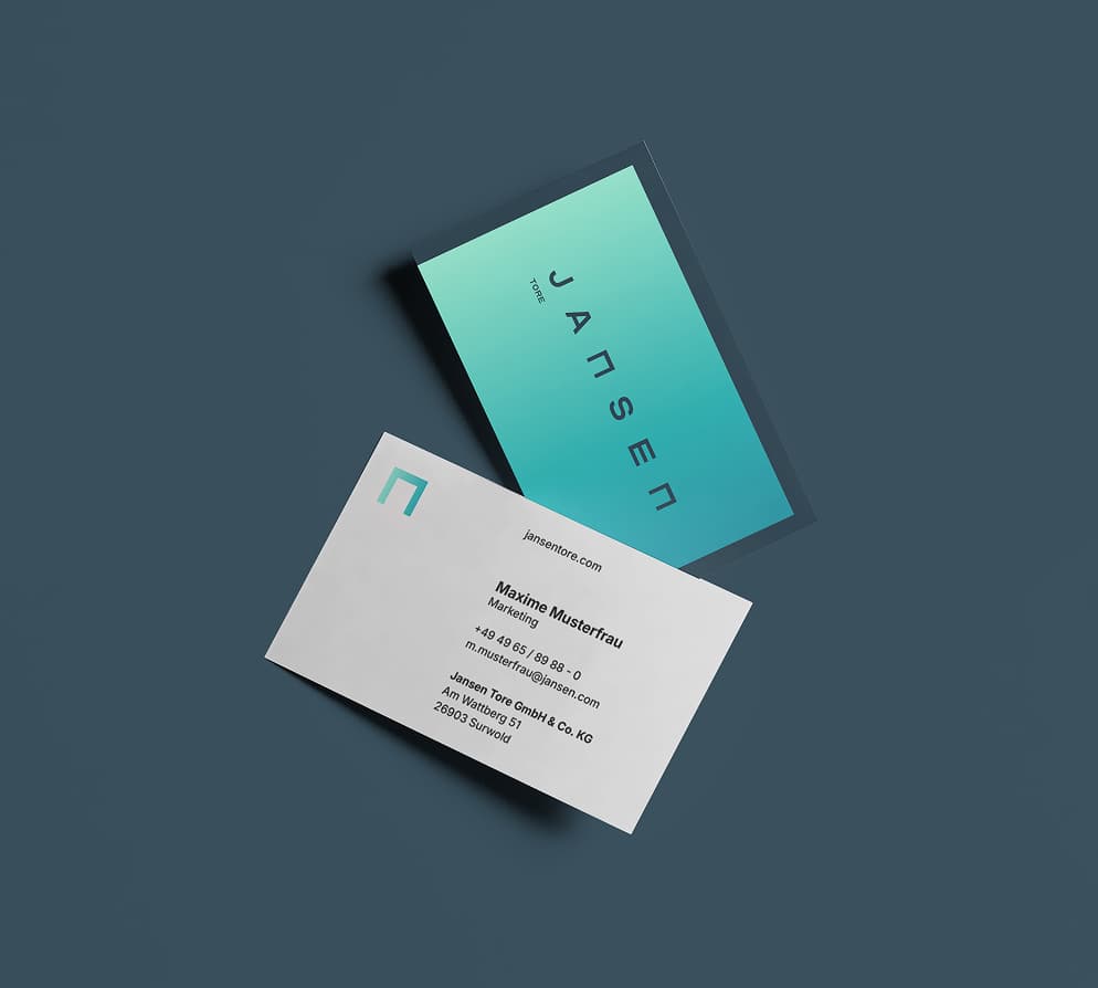
Jansen thinks big – in its typography, too. The new typeface is a perfect match for the new identity. A highlight is the "n", which represents a door and, as a visual element, translates perfectly to all communication materials, office equipment and merchandise.
Always on the safe side
Change always comes with uncertainty – and that is not an option for a company that has safety right in its claim. That is why we placed great emphasis on guiding and advising the team throughout all communication measures.
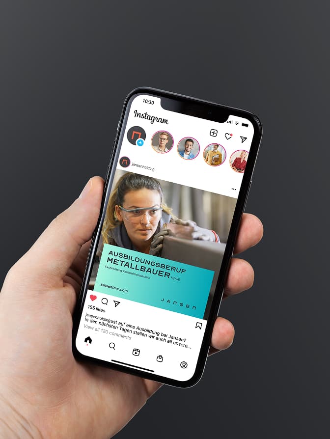
Impressions from everyday life at Jansen
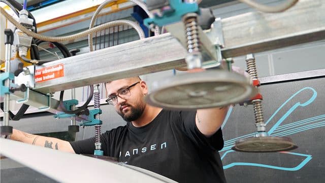
Photos and a relaunch film offer authentic insights into everyday work at the Jansen Group and bring the new visual identity to life.






Ready for a rebrand that makes an impact? Talk to us about your brand.
Janine WankelmannExecutive Director Marketing and Sales